






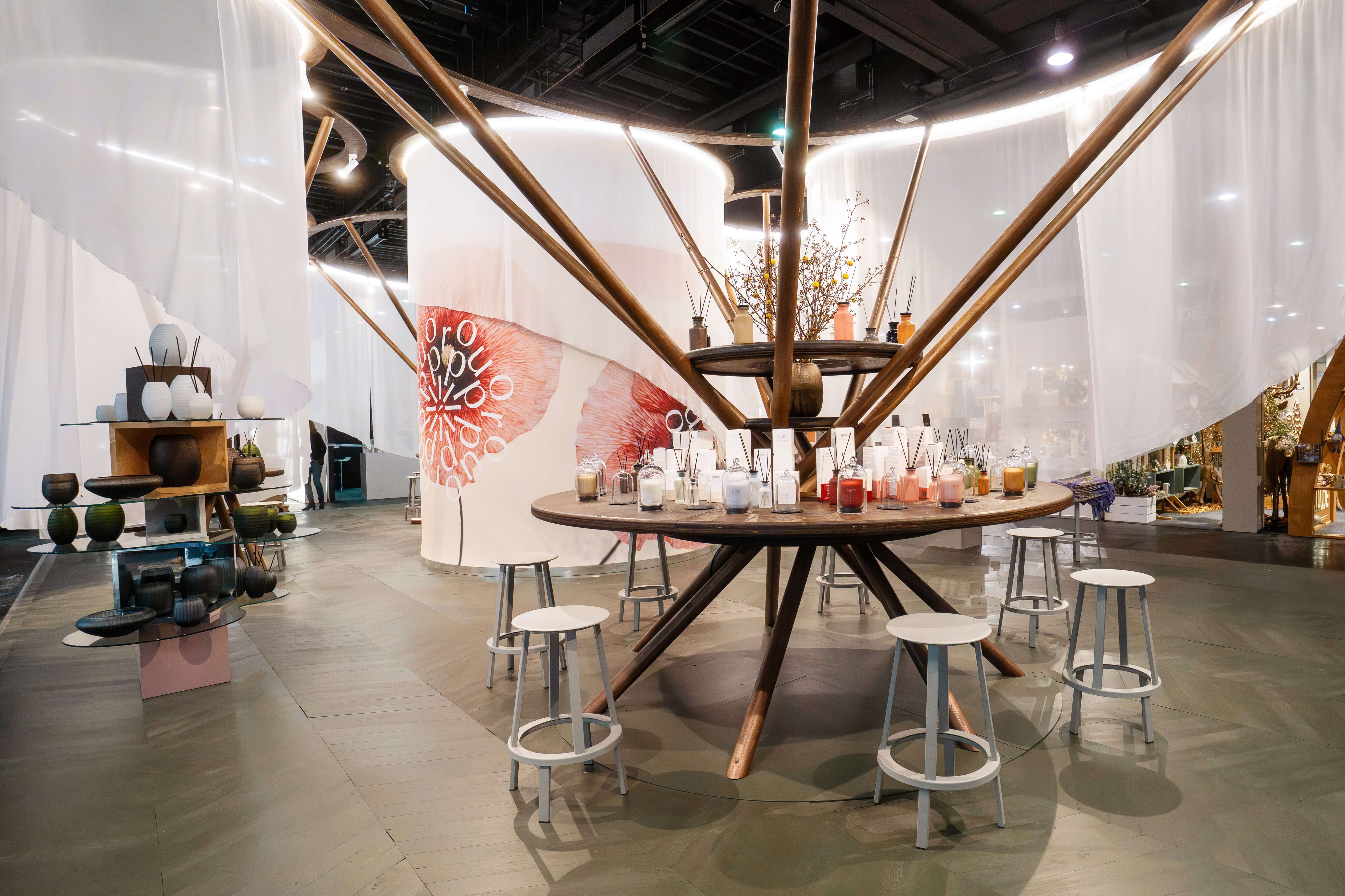
From commercial product to premium brand
The further development of ipuro follows a clear and stringent brand logic. Starting from its original role as a private label, ipuro has developed into an independent brand over the years and today consistently positions itself as a premium brand in the room fragrance segment. This change is the result of a continuous maturation process based on experience, market understanding and a clear vision. The aim of the new development was to make this grown identity visible and to position the brand for the future.
The proven brand identity that has accompanied ipuro successfully for many years was not replaced or negated. Rather, it was deliberately further thought out and carefully sharpened. The essence of the brand was retained while structures, content and expression were modernized. The focus was on the question of how ipurod can meet today's requirements for brand management, digital presence and contemporary staging without losing its origin and recognizability.


A holistic brand system
The focus of the new development was the comprehensive realignment of the entire brand system. Beyond the logo, a holistic set of design and communication elements was created that allows the brand to be experienced in all its facets.

Visual design
A concise icon, modular and movable brand elements, digital applications and modern, distinctive typography create a flexible and recognizable visual basis.

Brand communication
A clearly defined imagery that combines calm, value and emotionality, as well as a clear tonality, ensure that the brand attitude is consistently conveyed.
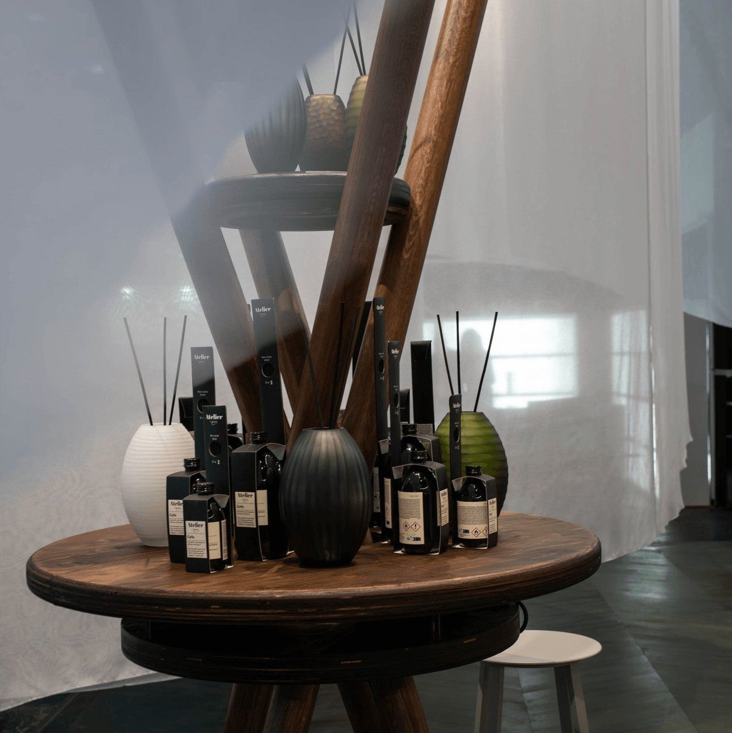
The new brand system is designed to be flexible and works across all relevant touchpoints. Whether digitally, in retail, at trade fairs or in brand communication, ipuro today appears consistent, self-confident and high-quality. The design not only supports recognition, but also orientation and brand loyalty. Content, design and function mesh seamlessly and create a harmonious overall picture.
The result of the new development is a brand that is holistic and clearly conveys its premium claim. ipuro presents itself as valuable, reduced and contemporary without losing proximity or authenticity. The new brand identity creates the basis for future growth and strengthens ipuro as a reliable, inspiring brand with a clear attitude and long-term perspective.
Discover our collections

CLASSIC
Minimalist scents for every day - from citrus to floral to maritime. The all-rounder for every ambience.

EXCLUSIVE
High-quality perfumery art meets noble raw materials – exclusive compositions for discerning fragrance lovers.

LIMITED
Seasonal fragrance creations with a special theme - ideal for spring, Christmas and all special moments.
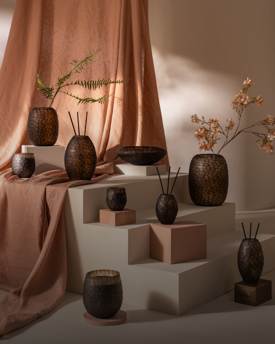
Atelier by ipuro
Four extraordinary scents with unique characters - from gourmand to woody to floral - create a special atmosphere for your home.

ESSENTIALS
Timeless scents with a rebellious twist – sensual, exciting and full of character. For fragrance fans with style.

FUNCTIONALS
Functional scents against cooking smells or for a relaxed mood - practical, aesthetic and effective.
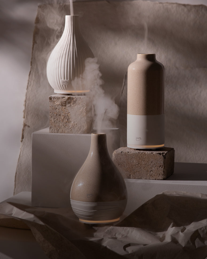
AIR SONIC
Gentle aroma mist for your scent routine – individual, modern and suitable for your mood.

WE ARE:
Sustainable scents with upcycled ingredients - inspired by nature, perfect for every mood and every room.
Find out more about us

Fragrance expertise
High-quality fragrance compositions are the heart of ipuro. Experienced perfumers, selected raw materials and a fine sense of balance ensure room fragrances that have a subtle effect and inspire in the long term.
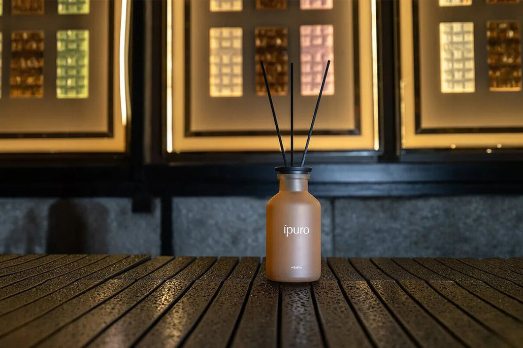
Design expertise
At ipuro, design is more than aesthetics. It combines product, fragrance and space into a consistent brand experience and shapes the appearance across all channels.

Engineered in Germany
The combination of German fragrance development and European production stands for quality, precision and reliability. Long-term partners and established processes ensure high standards in every phase.
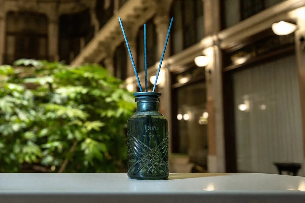
Brand values
The brand values of ipuro are firmly anchored in the identity and shape thinking, design and development. They form the basis for a clear attitude and an unmistakable brand presence.